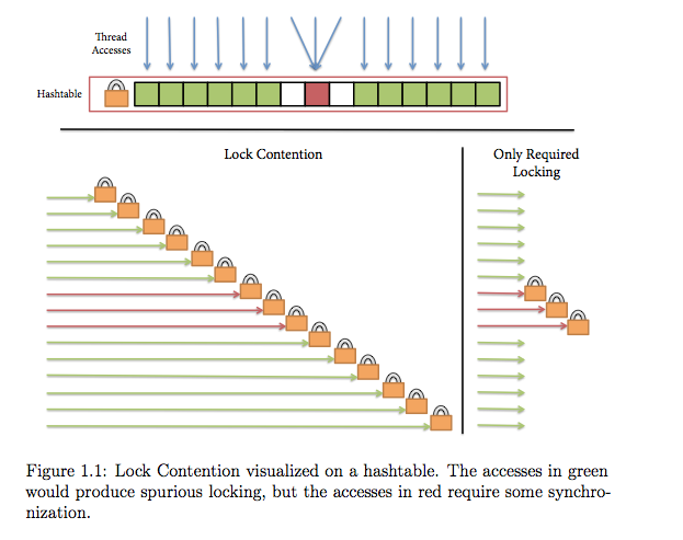
Honestly, I cannot get over how terrible the PDF rendering is in Adobe Acrobat vs Apple's Preview.app:
Adobe's rendering (ignore the comment) -- Note the jagged edgiest, the varying width arrows, the bizarre aliasing artifacts.
Nice smooth, even lines. Nice rendering of fonts, no aliasing etc.
It's embarrassing that Adobe of all people can't seem to get PDF rendering looking good. I don't know what magic Apple is using, but for this diagram, their rendering is an order of magnitude more faithful to what I actually drew.

